Role:
UX Designer
Taskly is a simple project management software that helps you to keep on track. One who once begins completing tasks one after another and sometimes even multi-tasking without stopping to the point of exaustion is a TASKLY person.
Methods & Practices:
Competitor Analysis, User Research, User Persona, Task Models, Customer Journey Map, Card Sorting, Sitemaps, User Flows, Prototyping, Wireframing, A/B Testing, Lean UX, Design Thinking, UI Design
Tools:
Sketch, Adobe Illustrator


Taskly Definition
Date:
2018
Premium Item Login to buy access to this item. Similar: Microelephant – CRM & Project Management System WORKSUITE – Project Management System Business Manager – Open Source Project & Team Management Luxx – Clients, Invoices and Projects Management System. TASKLY One who once begins completing tasks one after another and sometimes even multi-tasking without stopping to the point of exaustion is a TASKLY person. See Definition For TASKLY #task #completing #anal #compulsive #orderly.
Sector:
Student project for Career Foundry
This UX Design concept shows the journey of developing Taskly, a new task management app. In my role as the UX Designer I conducted every step of the process - from research to conception to testing and visual design.
This project was accompanied by a three-month UX Design training followed by a fixed course plan. It helped me to gain and deepen my knowledge in UX Design methods, following the Design Thinking approach.
The basic idea of Taskly was creating a task management app, which helps people to organise the to-dos of their daily life efficiently, either at work or privately. The market in this sector is highly competitive. Therefore creating a product that stands out on the one side and copes the requirements of the user on the other was the challenge to face. A good reason to start diving deeper into the subject matter.
How might we create a task management app in a highly competitive market, which is easy to use
Knowing the market and therewith the strengths and weaknesses of the competitors means evaluating the chances and risks for our app. Who are the main competitors, how do they differ from each other and where do they stand out? Based on the findings we can get a first idea of chances and risks for a product and are able to derive a strategy and assumptions on the user.
Market Research
I created competitive profiles for the three main competitors accompanied by a SWOT analysis. Using these methods helped to get to know the main industry of Taskly, its potential customers and features as well as the target market. Based on that I was able to define a MVP of Taskly.
Now we’re having a more detailed picture of the market, but what about the user? We need to understand and get to know the needs and goals of the potential users in order to create a successful app. Therefore I started the User Research phase by approaching a group of potential Taskly users.
User Research
First, I conducted a survey followed by interviews, which are both great tools to validate assumptions about needs, expectations and experiences of the potential users.
What I wanted to find out:
Who is the target group?
Is there a need for private usage, work usage or both?
How customizable should the app be?
Is there a desire for collaborating?
How is the general willingness to use such app?
Findings:

There is a need for organising tasks digitally, especially in the work life, collaborating with business partners or teams. Since work can be overwhelming and stressful, it needs to be simple and easy-to-use, clean and collaborative. The more team members the more customizable it should be.
user persona
User Persona is the representation of the ideal customer. They incorporate the needs, goals and behaviour patterns of our target group and therefore help focussing of the core features in the design process. This is a good method to better emphatise with the main user and prioritise goals according to their needs.
Based on the quantitative and qualitative data from the User Research, I created three Personas for Taskly. Please say hello to Heike, Stephan and Maren!
Which steps do users take to fulfill a task and how do they feel on the way to its goal? Task Models and Customer Journey Maps are a good way to visualise the logical way and the activities of a user. It includes the steps they take as well as their needs, expectations and overall experiences, always taken from the user’s perspective. Both tools are essential in user-centred design.
task model
Thomas, the user, had to organise a band showcase for media partners. Using the task model, I accompanied him from the decision to make a showcase to finally having it done and found out about his requirements and problems.
Customer Journey Map
Knowing Thomas requirements and problems, I wanted to investigate on his feelings along the way. Where are the blind spots, where are the touch and pain points? This way I was able to find opportunities for Taskly.
After adjusting the MVP according to the findings from the research we could now continue with a meaningful structure. But wait…what does meaningful mean? When following the user-centred approach, involving the user at this stage is the only way to find out. Card Sorting is a method where the user organises the content. That way you can discover not only their way of thinking but also how they put topics into groups making sense from their perspective, finding issues within your current structure.
Card Sorting
I approached a group of potential Taskly users and conducted card sorting sessions with them. Revealing overlapping patterns, noticing unclear labels and finding unrelated topics was very helpful to understand how to organise the optimal structure for the user.
Sitemap
Based on the card sorting results I created a sitemap for visualizing the architecture of Taskly. This way everyone involved in the design process was able to get a picture of the hierarchy and structure of the app.
With all the information gained the designing phase can be started. This includes testing and iterating based on the test results, following the Lean UX approach. The easiest and fastest way to find out about how your app works or if there are any issues in the user flow is testing a prototype. That way we can simulate the finished product being able to test it with users and make changes according to findings right away.
Paper Prototypes
I created paper prototypes with the basic features and started testing them with a group of users. Including the thinking-aloud tool for testing I was able to not only follow their interactions but also find out more about their emotions and thoughts during the interactions. Very useful insights!
Wireframes

Wireframes are visual representation of the user interface not taking detailed design or brand elements into account. That way the hierarchy and communication of items on a page can be defined based on user needs.
Same as the prototypes, I created wireframes for Taskly and tested them with a group of users. The feedback and results helped finding the pain points. Therefore these could be solved and the flow adjusted until it was flawless and smooth.
On the basis of results of the testing and iterating phase, a UI Kit can be created. It contains all the necessary elements of the app in order to make sure consistency is given to the visual design.
The one for Taskly was developed by a process of iterating from mood boards and style tiles and finally to creating a first version of the style guide.
How can you find out about the impact and effectiveness of the design and user flow of your app? A/B Testing and First Click tests can be a great help. With these testing methods you can get direct and measurable feedback from the users about their preferences and the reasons why, helping to iterate on the design.
Taskly Nulled
A/B Testing
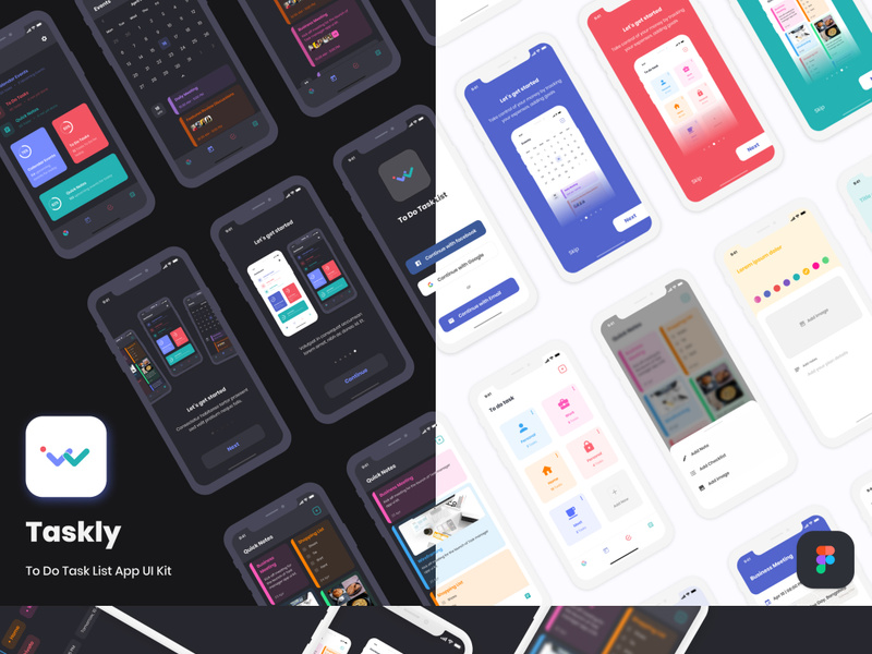
I conducted an A/B testing and First Click Tests for Taskly’s design, finding out that the dark color scheme was not appreciated due to less readability and feeling uncomfortable with it. All CTAs have been clear and understood.
Task Lyst Scott Hylbert
The market is highly competitive but still the need for managing tasks digitally at work, especially when collaborating with teams is high.
Potential users wished and decided for easily usable functions, a clean design and collaborative tools as the minimum requirements, with the core function of creating and editing To Do lists.
Tashlyk Ukraine
Calm and light colors had been preferred over the dark color scheme.
After a journey of three month we can say “Hello” to the first drafts of the Taskly MVP.
Tasklayout Update
Take your time to research.
Defining the problem, which you want to solve, is key.
Be brave to try things, but always test them, the user will tell you in the end.
Find the right tools and methods for your needs.
Always ask for feedback and be open to receive it.
